Telling vs. Showing: How Layout Shapes the Story of a Portfolio
We tend to think of a photography portfolio as a container, a digital folder of images, neatly presented. But it's more than that. A portfolio is a lens through which your work is experienced. And the layout you choose quietly dictates how that experience unfolds.
This isn't a matter of taste or style. It's a structural choice that shapes perception.
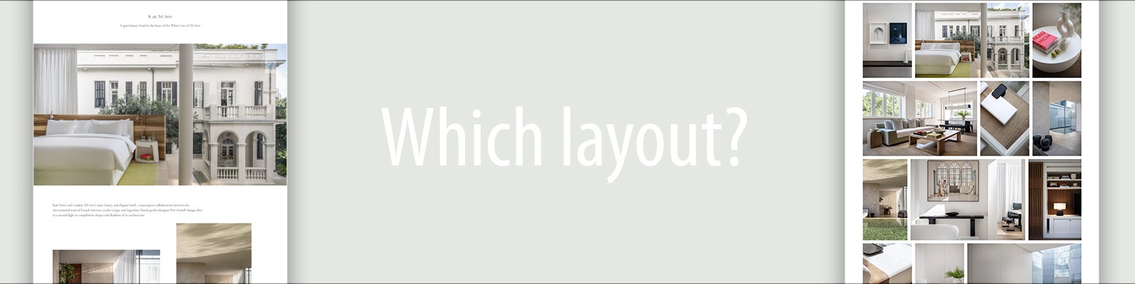
The Grid: Clean, Efficient, and Equal
For many photographers, the grid or masonry gallery is the default. You upload a set of images, arrange them in rows or tiles, and voilà: a gallery. Everything is there, visible at once. It's orderly, familiar, and visually satisfying.
This approach works especially well when you want to show a wide range of images quickly, each photo stands strong on its own, and visitors are browsing, perhaps looking for a style or shot that resonates.
It's a format optimized for scanning. You land on the page and immediately see the scope: weddings, portraits, travel, interiors - all with equal visual weight. It's consistent and neutral, like a well-organized archive.
But that consistency comes with a subtle tradeoff: nothing leads the way. There's no pacing, no sense of unfolding. It's “democratic” - every image gets the same stage time, the same chance to compete for attention. But it can feel flat. You're looking at the work, not moving through it.
The Storytelling Flow: Guided, Rhythmic, Editorial
Now contrast that with a different kind of portfolio page. One that feels curated, editorial, and narrative-driven. Instead of a grid, you're met with a full-width hero image. Then a pairing of shots. A section break. A mini-gallery. Maybe a surprising vertical crop. White space. Another single image. A rhythm begins to emerge.
You're not just browsing; you're following.
This kind of flow mimics the experience of flipping through a magazine feature. It has pacing. Some images ask you to pause. Others move you forward. There's room for moments: a dramatic entry shot, a quiet detail, a burst of texture. The viewer is pulled into a world, not just a collection.
It's particularly effective when you're showing a cohesive project or series, mood and sequencing matter, and you want to evoke a feeling, not just showcase technique.
On Sivan Askayo's portfolio, for example, hotel projects unfold with this sensibility. A single architectural image sets the tone, followed by lifestyle shots, a short video, closeups of textures, scenes of light and shadow. You feel the space - not just see it. It's immersive. Intentional. Designed.
A Matter of Experience, Not Just Aesthetics
These two layouts, the gallery grid and the storytelling flow, are not in opposition. They serve different goals.
The grid says: "Here's everything I want to show you. Browse freely."
The flow says: "Let me take you on a path. Here's how I see."
One is optimized for clarity and accessibility. The other for emotion and sequence. One feels more like a portfolio review: logical, well-presented. The other feels like an editorial feature: selective, designed, human.
And that difference - the experience of browsing versus being guided - is what transforms the perception of the work.
Not Either-Or
You don't have to commit to one approach across your entire website. Many photographers use both: a grid on the homepage to show breadth or categories, and a storytelling flow within each project or gallery.
This hybrid approach lets you provide orientation first, then dive deeper into crafted experiences. Like an index leading into chapters.
What Do You Want Your Viewer to Feel?
That's the real question behind layout. Not "what looks good?" but "what supports the kind of attention I want?"
Do you want to let your visitors wander freely, or invite them to sit down and linger? Do you want to present everything at once, or control the pace and flow?
There's no single right answer. But once you see how layout shapes experience, it becomes impossible to unsee.
Because a portfolio isn't just what you show - it's how you show it.
